
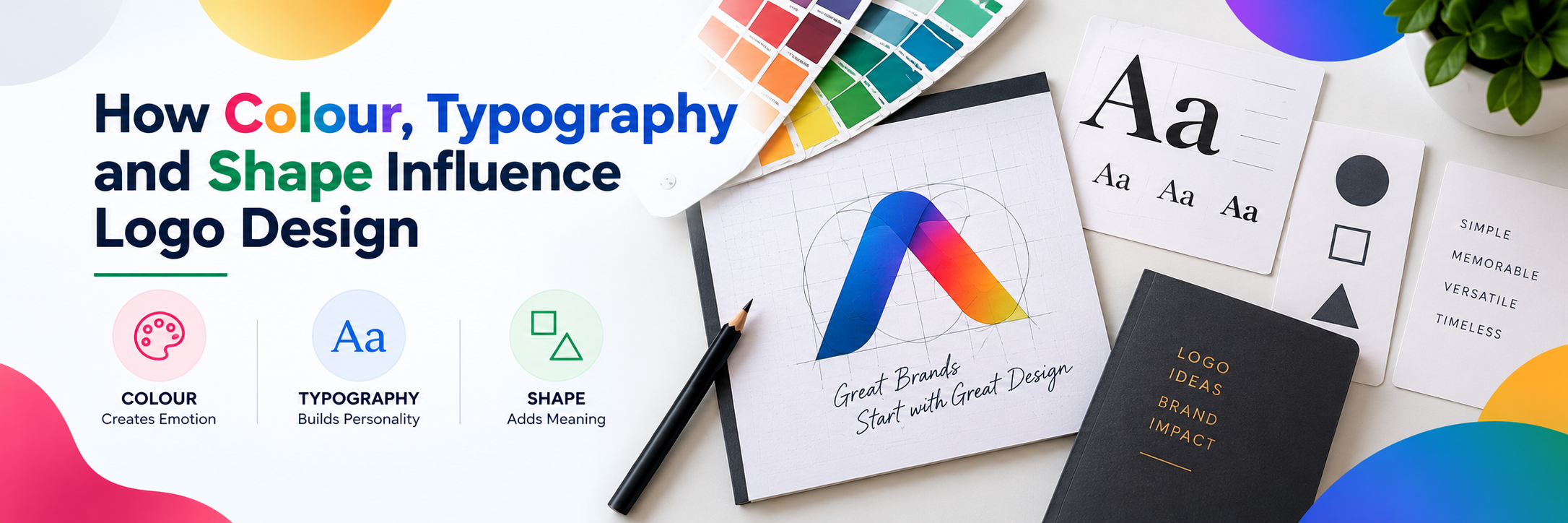
A logo may look like a simple graphic, but every element within it can influence how people perceive a brand.
The colours you choose can create an emotional impression. The typography can communicate personality. The shape can influence how the logo feels and how easily it is recognised.
A strong logo brings these elements together to create an identity that is distinctive, memorable and relevant to the business.
When colour, typography and shape work together effectively, a logo can communicate a brand message before people even read the company name.
Here is how these three elements influence logo design and what businesses should consider when creating a logo.
1. Colour Creates the First Impression
Colour is one of the most noticeable elements of a logo.
Different colours can create different visual and emotional associations. For example, some colours may appear energetic, while others may communicate stability, professionalism or creativity.
When choosing colours, consider:
- Your brand personality
- Your target audience
- Your industry
- Competitor branding
- Where the logo will be used
- How the colour works across digital and print formats
The goal is not simply to choose a colour that looks attractive. It should support the identity you want your brand to communicate.
2. Too Many Colours Can Reduce Clarity
A logo does not need a large colour palette to stand out.
Using too many colours can make a logo feel complicated and may make it difficult to reproduce consistently across different applications.
A strong colour system should be:
- Simple
- Recognisable
- Consistent
- Easy to reproduce
- Appropriate for different backgrounds
In many cases, a focused colour palette can create stronger brand recognition than an overly complex combination.
3. Typography Communicates Brand Personality
The typography used in a logo can influence how people perceive the brand.
A bold typeface can create a different impression from a refined or minimalist one. The choice should therefore reflect the personality and positioning of the organisation.
Consider:
- Font style
- Letter spacing
- Weight
- Readability
- Proportion
- Relationship with the logo symbol
Typography should not simply look stylish. It should work with the rest of the identity and remain clear at different sizes.
4. Readability Is Essential
A logo may appear on a website header, business card, presentation, product packaging or social media profile.
If the lettering becomes difficult to read when the logo is reduced, the design may lose its effectiveness.
Make sure the typography remains:
- Clear
- Legible
- Balanced
- Appropriate at different sizes
- Distinctive without being difficult to understand
A good logo should remain recognisable whether it is displayed large or small.
5. Shape Influences How a Logo Feels
Shapes can also influence how a brand is perceived.
Rounded shapes may create a softer and more approachable impression, while sharper geometric forms can appear structured, modern or precise.
When developing a logo, consider how shape communicates:
- Stability
- Movement
- Strength
- Simplicity
- Precision
- Approachability
The right shape should support the brand message rather than being selected simply because it looks interesting.
6. Simplicity Makes Logos Easier to Remember
One of the biggest challenges in logo design is trying to communicate too many ideas at once.
Too many colours, complicated symbols, decorative fonts and unnecessary details can make a logo difficult to understand and remember.
Focus on:
- One clear idea
- Simple shapes
- Limited colours
- Appropriate typography
- Strong visual balance
A simpler logo is often easier to recognise and easier to use across different brand touchpoints.
7. All Three Elements Need to Work Together
Colour, typography and shape should not be treated as separate decisions.
They need to create a consistent visual language.
For example, a modern geometric symbol combined with an overly decorative typeface may create a visual mismatch.
Review your:
- Colour palette
- Font selection
- Symbol or icon
- Spacing
- Proportions
- Overall visual balance
Every element should contribute to the same brand personality.
8. Your Logo Should Work Across Different Applications
A logo is rarely used in only one place.
It may appear on:
- Websites
- Social media
- Business cards
- Presentations
- Packaging
- Signage
- Advertising
- Corporate documents
A strong logo should maintain its identity across these different applications.
Consider creating appropriate variations such as:
- Full-colour logo
- Single-colour logo
- Horizontal version
- Stacked version
- Icon or symbol
- Light and dark background versions
This makes the identity more flexible and easier to maintain consistently.
9. Consider Your Industry Without Copying Competitors
Industry conventions can provide useful context.
A financial company, technology business and creative agency may need different approaches to communicate their positioning.
However, following industry trends too closely can make your logo look similar to competitors.
Research the visual landscape and identify:
- Common colours
- Common symbols
- Typical typography
- Competitor identities
- Opportunities to differentiate
The objective is to create a logo that feels relevant to its industry while remaining distinctive.
10. Test the Logo Before Finalising It
A logo may look good during the design stage but behave differently when used in real situations.
Before finalising the design, test it across:
- Different sizes
- Different backgrounds
- Digital screens
- Print materials
- Black and white applications
- Social media profiles
- Website layouts
Ask whether the logo remains clear, recognisable and consistent in each situation.
Testing can reveal issues that may not be obvious when looking at the design in isolation.
A Better Approach to Logo Design
Effective logo design is not about choosing a colour, font or shape individually.
It is about creating a visual system in which every element supports the same brand idea.
A strong logo combines:
Relevant colour + appropriate typography + meaningful shape + simplicity + consistency + flexibility
Start by understanding the brand, its audience and its positioning.
Then use colour, typography and shape to translate that understanding into a visual identity that people can recognise and remember.
The goal is not simply to create a logo that looks good.
It is to create a logo that communicates clearly and works everywhere your brand needs to appear.
Final Thoughts
Colour, typography and shape can significantly influence how people perceive a logo.
When these elements are chosen thoughtfully, they can help create an identity that feels distinctive, professional and relevant to the brand.
A successful logo does not need to be complicated. It needs to communicate the right idea, remain recognisable and work consistently across different applications.
For businesses looking to create a stronger visual identity, Vizcom combines logo design, branding and creative communication to develop identities that help businesses communicate their personality, positioning and value with greater clarity.